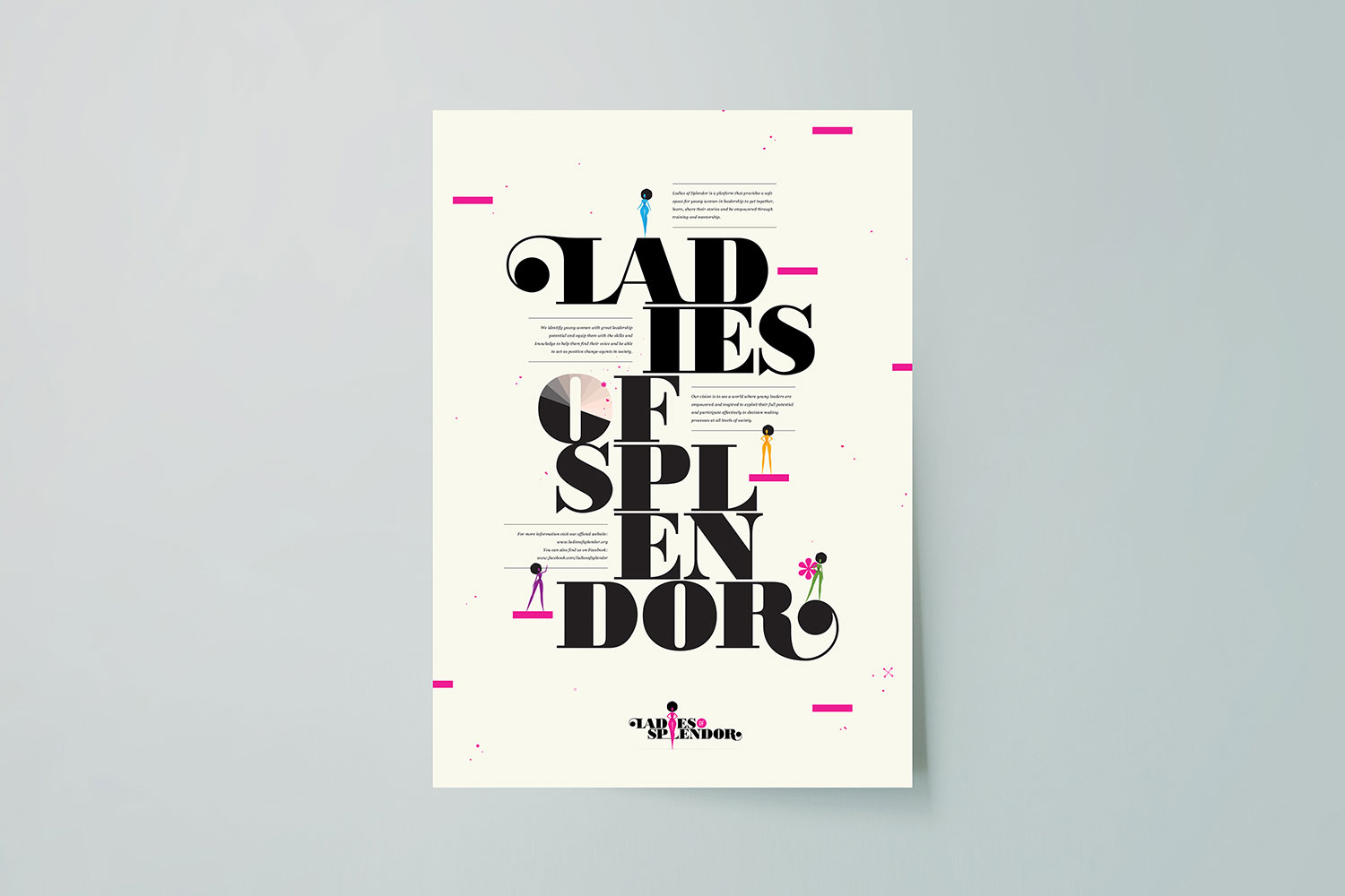
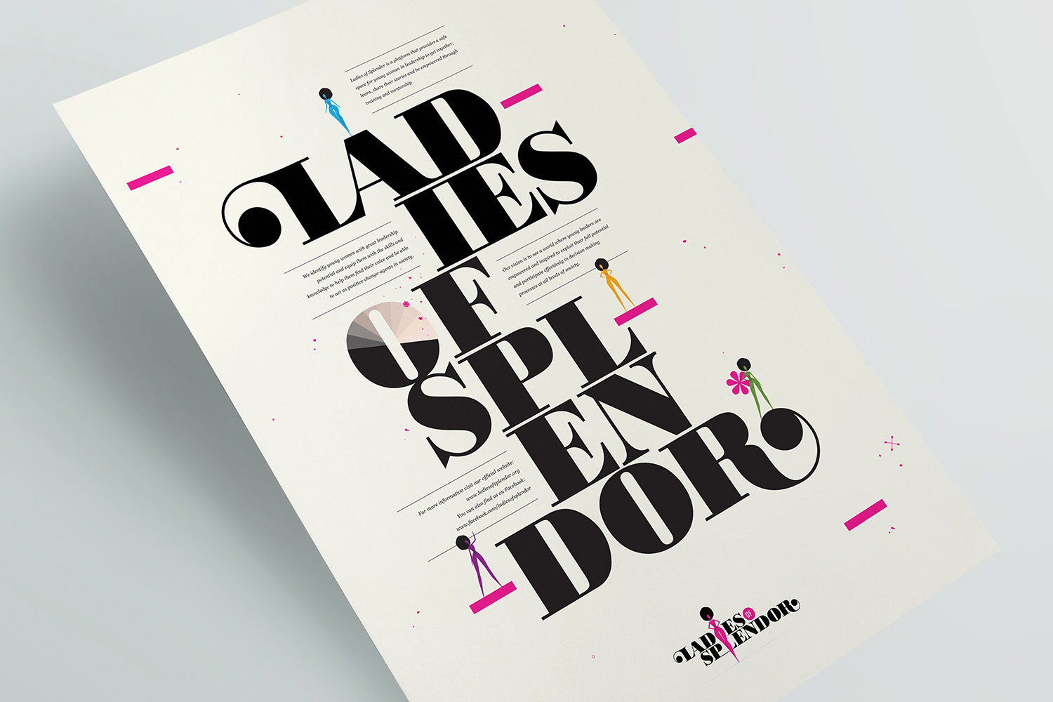
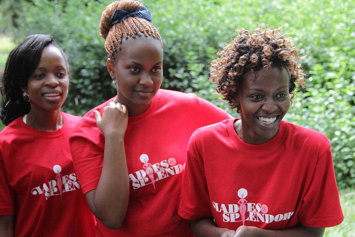
Ladies of Splendor is a platform that provides a safe space for young women in leadership to get together, learn, share their stories and be empowered through training and mentorship. The organisation identifies young women with great leadership potential and equips them with the necessary skills and knowledge to help them find their voice and enable them to act as positive change-agents in society.
The visual identity needed to reflect the youthful, bold, innovative brand personality – and provide a unique visual language for the platform that the girls would love and be proud to be a part of.
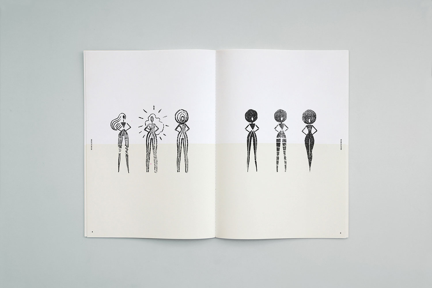
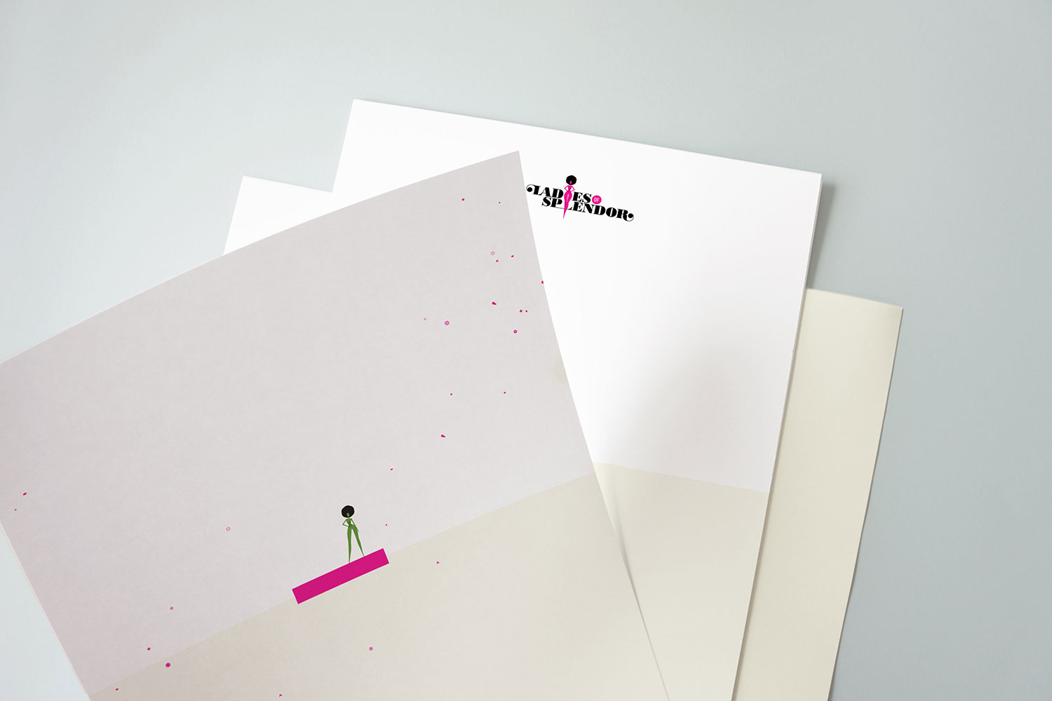
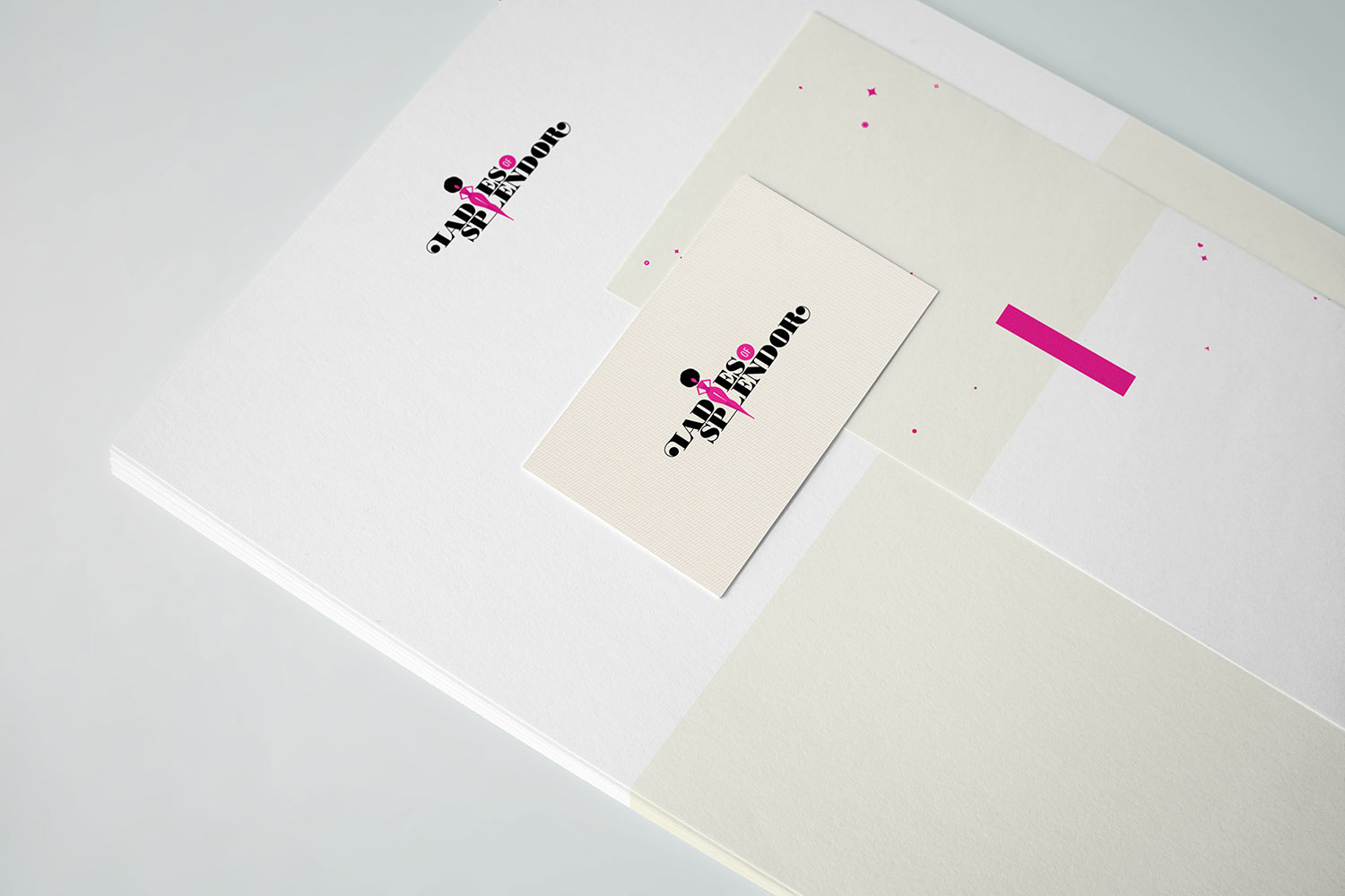
The main visual elements are strong, stylised silhouettes of women that represent youth, power, attitude and confidence. Given that the project ‘Ladies of Splendor’ is based on identifying particular young women that stand out because of their potential for future leadership and decision-making skills, we emphasised the uniqueness of each woman through the use of bright colours, representing the various talents and personalities of the young women the organisation supports.
Every woman has her own colour – her specific potential for a successful career in leadership. The playful female silhouettes and scattered geometric elements are balanced with strong, elegant typography and a restricted colour palette of white and cream, providing an air of sophistication and simplicity.
→ Featured on the Behance AIGA Member Gallery
→ Featured on Creativepool
ClientEmerging Leaders FoundationServicesGraphic Design, Branding, TypographyYear2013OrganisationSpark* InternationalArt DirectionMarianna Orsho, Katarina MatkovicIllustrationMarianna OrshoLinkladiesofsplendor.org