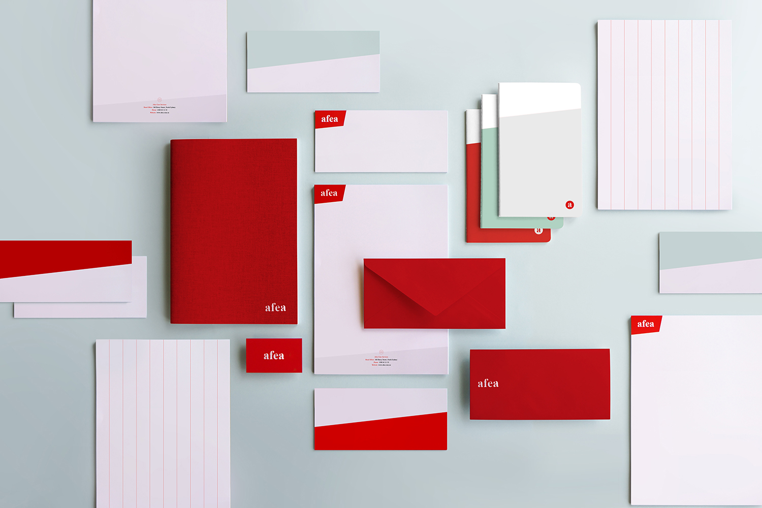
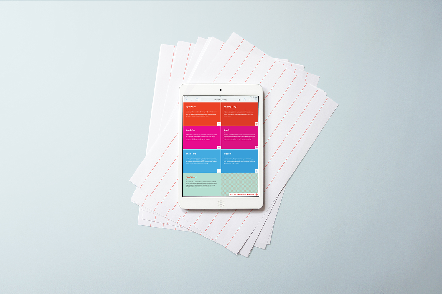
Afea is one of Australia’s leading health care providers, offering skilled nursing, personal care, rehabilitation and therapies to people of all ages. Afea offers personalised solutions tailored to individual needs and aims to provide support and understanding during difficult times. In 2014, Afea began the process of becoming a franchise and needed a visual identity that would help them stand out and distinguish themselves in the health care industry.
Founded with the idea to innovate the health care industry, Afea’s new identity needed to reflect their modern approach as well as their professionalism – with warmth. Afea approaches all situations with care and empathy, and the visual identity needed to show that they are company that people can trust to take good care of their loved ones.
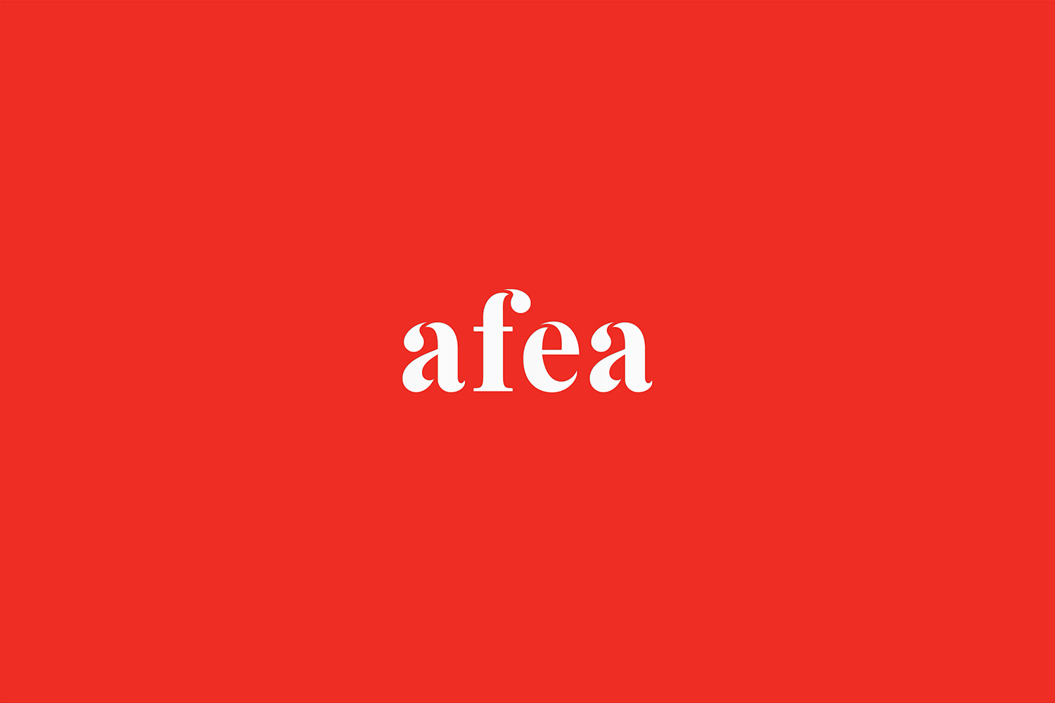
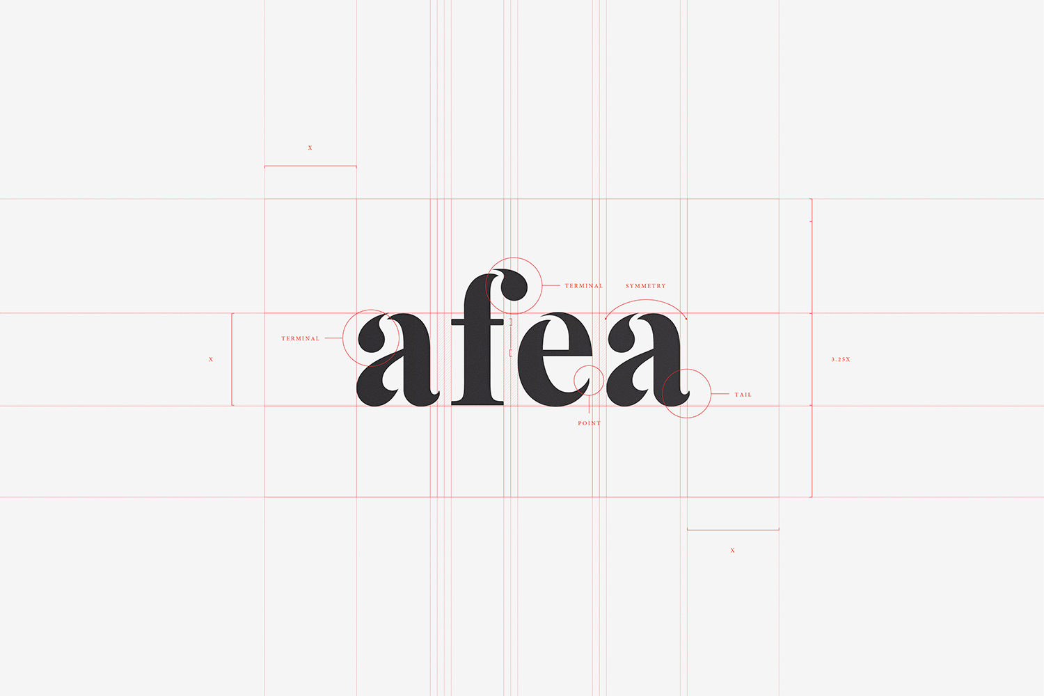
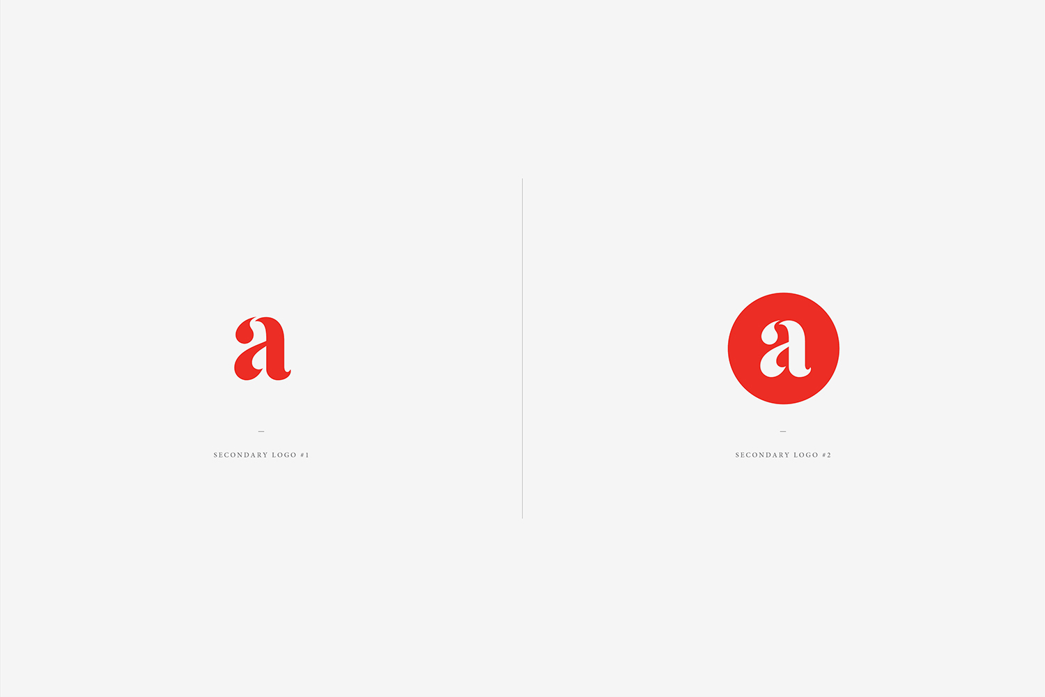
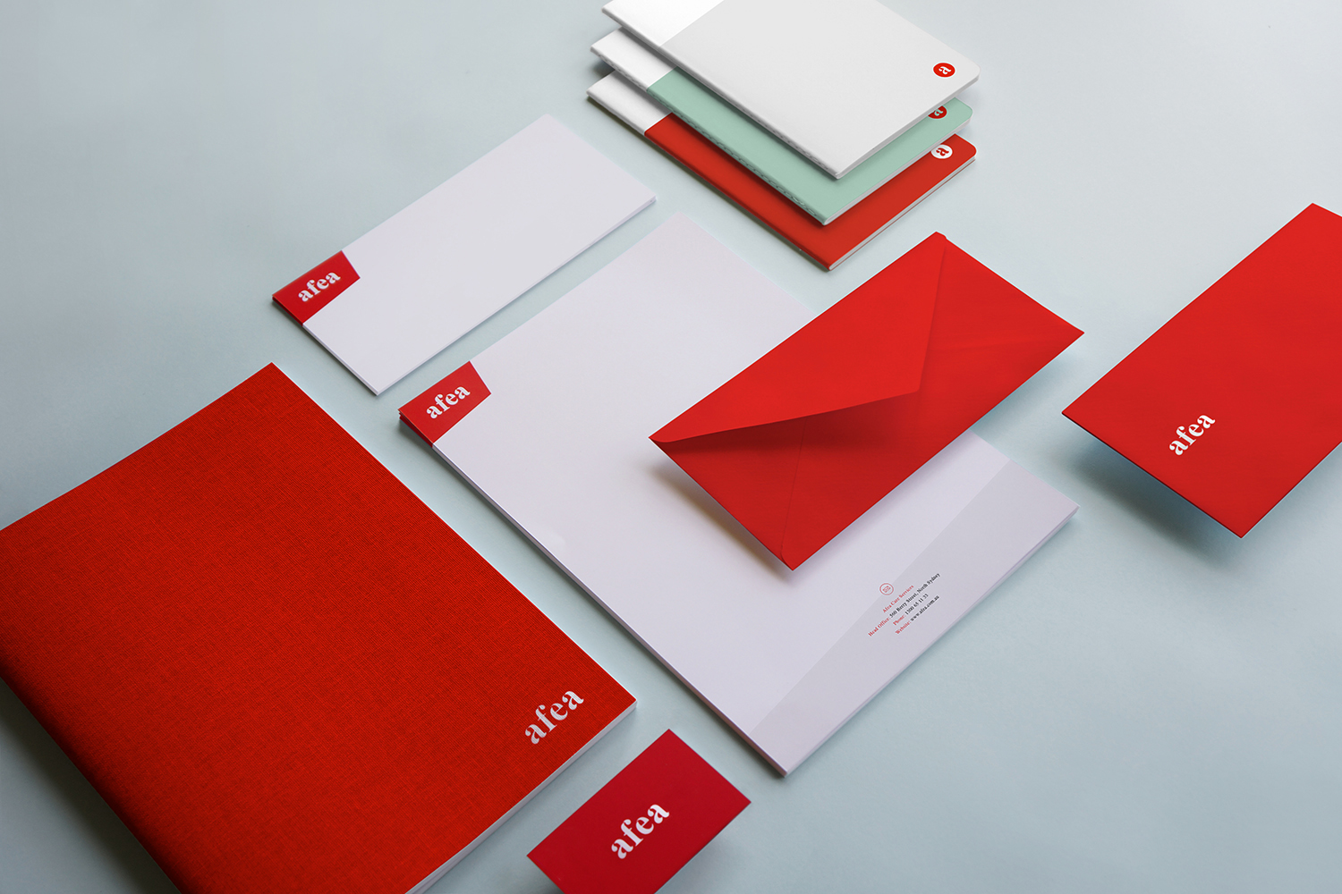
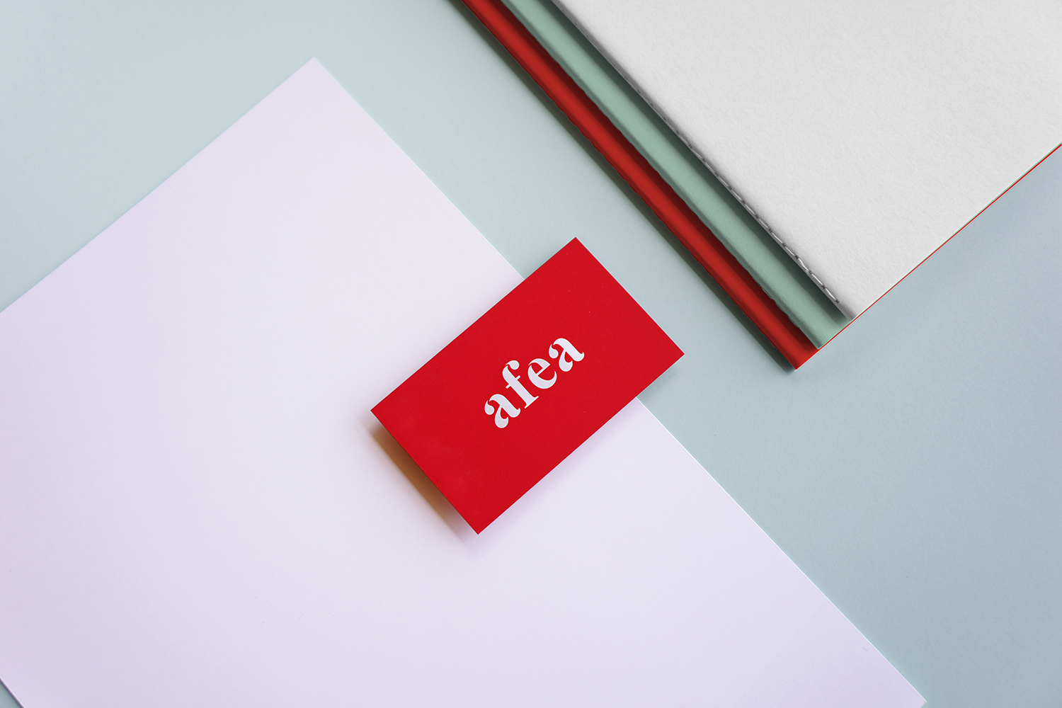
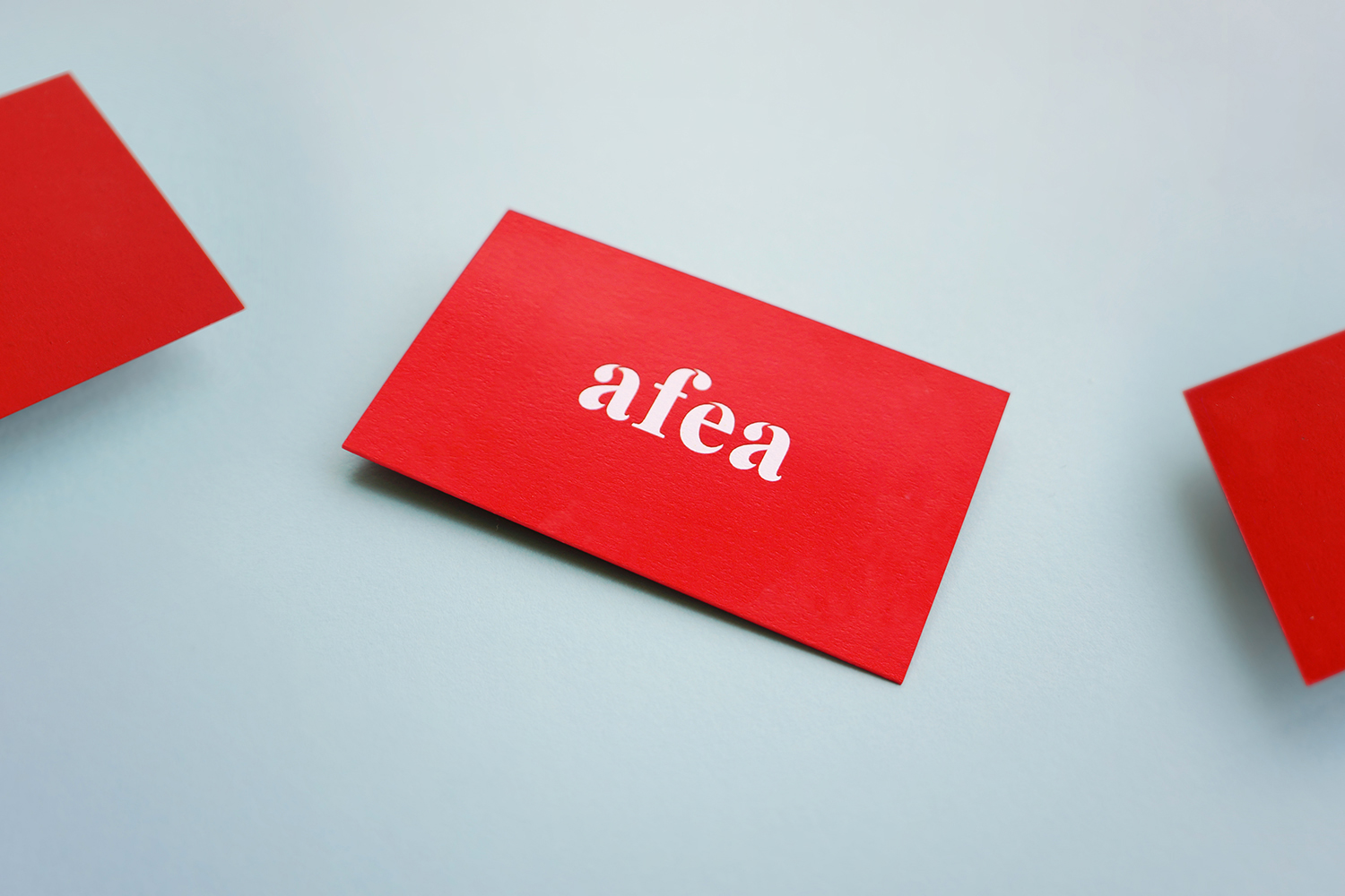
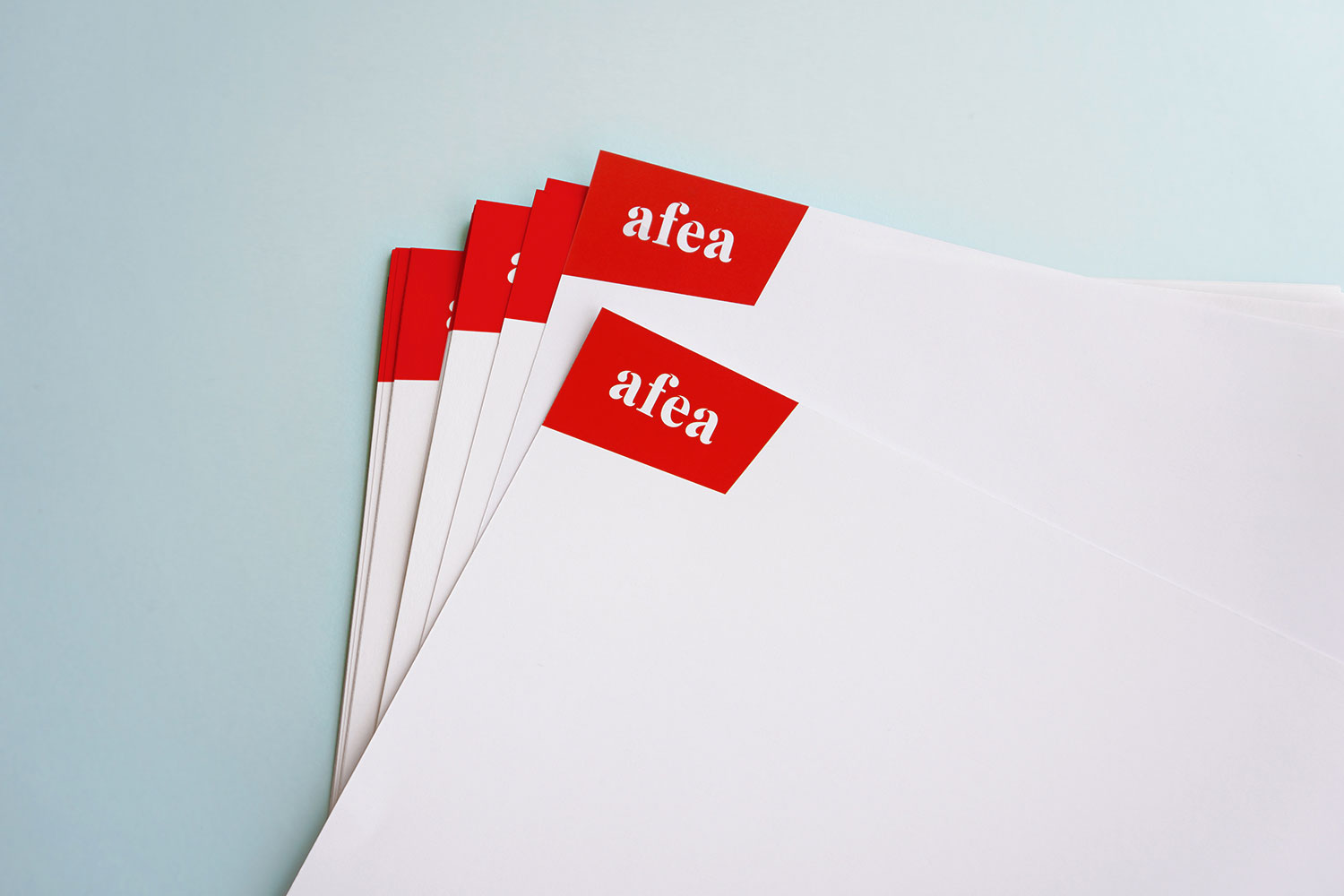
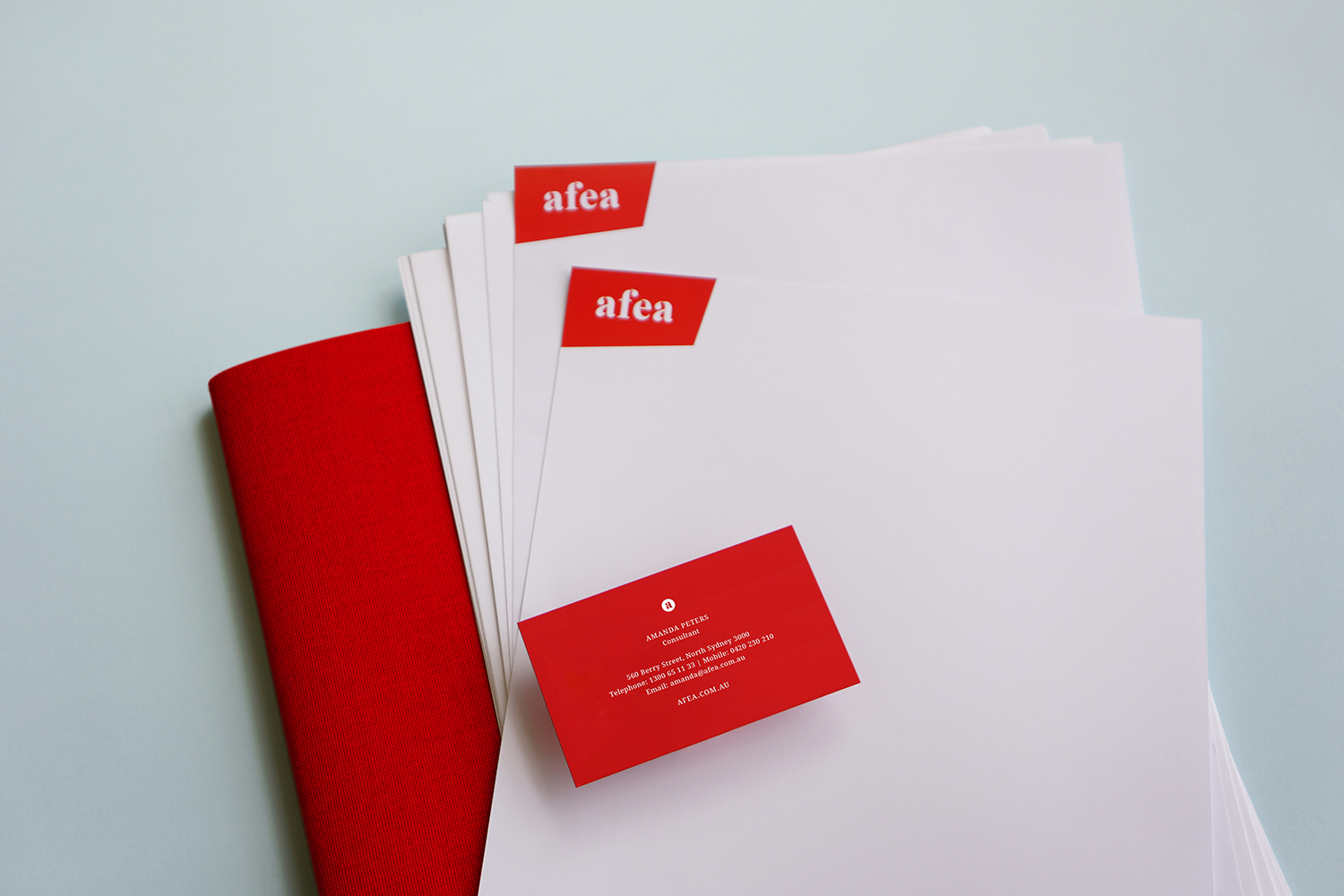
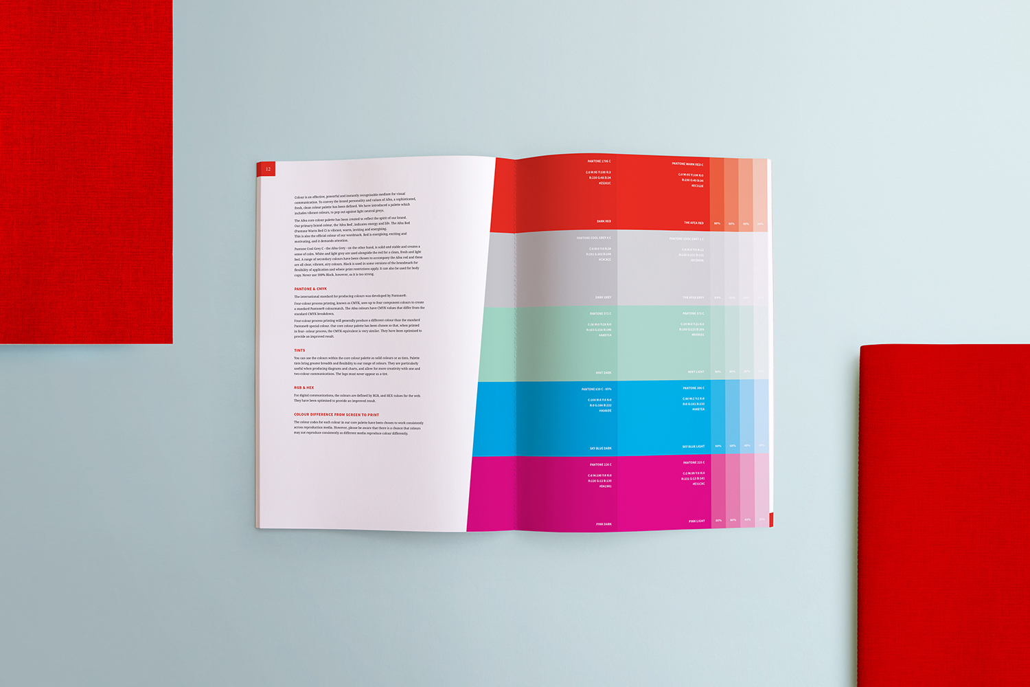
The new identity utilises a clean, modern aesthetic, changing the way people experience the brand. The logo is soft but sophisticated, correlating with the polished, nurturing nature of the company, and a subtle ‘water droplet’ feature also indicates natural elements.
The logo is created with custom typography, based on the familiar letterforms of Times New Roman – however, the serifs have been softened, the spurs on the letter a’s curl into a charming little point, and the characteristic ‘droplets’ add intrigue whilst also giving fluidity and a unique touch.
→ Featured on the Behance AIGA Member Gallery.
ClientAfeaServicesGraphic Design, TypographyYear2014FirmDC StrategyArt DirectionMarianna OrshoBrand VoiceDaniel Vacic & Stephanie UnderhillLinkafea.com.au